
Digital Transitions, Gear Testing, Hardware, Phase One
Phase One Trichromatic: Part 2, the Results

Oct
Editor’s Note: This is the second part of a two-part article. Part 1 is here: Phase One Trichromatic: Part 1, The Science – How color works, more or less.
What Phase One Didn’t Do
Before we discuss specifically what Phase One did with the Trichromatic and where you will see the difference in real world image-making, let’s very briefly dispel some confusion and cover what they did NOT do. They did not remove the overlap between colors. If we look at the marketing Phase One did to launch the Trichromatic it would be easy to misunderstand the nature of how they’ve improved the color accuracy of the Trichromatic sensor. Look at the triangle image at the top of this article.
A reasonable viewer could easily interpret this as implying the Trichromatic removed the overlap between the response of the red, green, and blue pixels. That would be utter nonsense. The receptors in the eye, and any camera made to emulate them, must have overlap between the response of red, green, and blue. Without getting buried in math, it’s enough to say that, without the overlap, the camera (or eye) would be unable to see colors that fall between the cracks. In speaking with the designer of the illustration above, I learned that his intention was to communicate the result, rather than the process. That is, that the Trichromatic provides better color discrimination and provides for cleaner color, not that the Trichromatic used a CFA without overlap.
Phase One has since updated the use of this graphic to be followed by spectral response curves to avoid misinterpretation.
What Phase One Did
In short, Phase One, at the cost of R+D time and money in material science and color science research, decreased base ISO, improved the color filters used in the CFA of the Trichromatic. Let’s take a look at the CFA of a typical camera and the CFA of the Trichromatic, and discuss some of the improvements made:
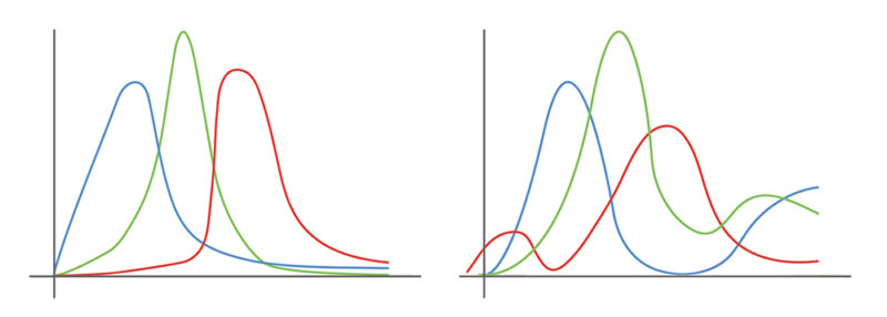
LEFT: Trichromatic CFA | RIGHT: Traditional CFA.
Reduced Overlap
The amount of overlap between the red, green, and blue spectral responses is decreased and is steeper. As discussed, some overlap is absolutely necessary, and indeed in the human eye the overlap between green and red is considerable, but with a digital sensor that overlap impacts color discrimination. The reduced overlap is one of the reasons the base ISO of the Trichromatic is ISO35 rather than the ISO50 base of its brother Phase One IQ3 100mp, which features a traditional CFA.
Tails Clipped; Cut the Near-UV
The receptors in the human don’t have much in the way of a lingering response; they have a range of the spectrum over which they respond strongly, and outside of which their response dramatically drops. But in traditional CFAs the red, green, and blue are “long tailed,” meaning they continue to respond well outside of their core domains.
For example, in the graph of the traditional CFA, note the red pixel response to UV and near UV (the left-most bump) and the green channel’s response to near IR (the right-most bump in green). Traditionally, camera companies have generally ignored these tails; after all, they are only a small percentage of the response of these colors and the contamination they imbue is fairly small. But cutting these tails turns out to significantly improve the rendering of problematic subject matter, turning dark leather red, skies purple, and dark skin tones slightly Oompa-Loompa. The improved “tail clipping” in the IQ3 100mp Trichromatic cleans the contamination in these subjects. Note that adding a UV cut or IR cut filter to the lens doesn’t eliminate the issue, since the problem often extends into the near UV for red pixels and near IR for green; the response has to be cut at the CFA level.
Better Response Balancing
Each color in the Trichromatic is better balanced with respect to how much light it sees. Often sensors will have a stronger net response to one of the color channels. For example, a traditional CFA may have a broader and more powerful response to green than to red or blue (note that this is separate from the fact there are twice as many green pixels on a Bayer sensor than red or blue). With the Trichromatic, the response has been very carefully balanced. Note that when viewing the graphs above the maximum peak of the color response is not the only consideration; it is the total area under the curve within the relevant color range, so even though the green has a higher total peak its total response is the attribute that Phase One has carefully balanced.
This improved balance allows users to avail themselves of the IQ platform’s Exposure Clipping tool (different than the 1990s style exposure warning tool in most cameras) to perfectly expose to the right to minimize noise in the shadows. The downside of this is a slight loss in native ISO, since to balance the response means to trim the response of the strongest channel.
The above improvements mean that the data coming off of the sensors start closer to the final result that an expert profiler like Niels is after. Starting closer means less aggressive corrections are required during profiling, which makes for a better and more robust result. It also reduces color noise in deep shadows.
Image Review Note
Below are a variety of image sample comparisons. There are considerable limitations of such comparisons inside of a web browser. On the web these images are limited to 8-bit rather than the native 16-bit of the raw files, the color space is reduced to sRGB, and resolution and sharpness are compromised by the JPG compression, and only a small part of the image can be shown at 100% (for those images that are pixel-level-crops).
Rather than an the primary way of viewing these differences, I suggest you consider these online images as guideposts to help you understand where to look when you download the raw files (see the end of this article).
We also suggest reviewing the raw files on a high-quality monitor such as an Eizo CG or by making high-quality prints. Viewing raw files on a such a monitor will give you a more complete view of the differences.
What Kinds of Subject Matter Shows Improvement?
It’s great to talk about spectral response curves. Actually, I don’t know if that’s true; I find it fairly boring. But the real question is: WHERE and HOW will you see the improvements listed above manifest?
Remembering that State of the Art Color (as defined by the IQ3 100MP) was already very good, it won’t surprise you to learn that the differences won’t show up in every subject matter or every image. They will show up in subject matter that has problematic spectra; that is, subjects that reflect the parts of the visible spectrum that traditional CFAs mishandle. Most photographers who have been working for decades will already have a few in mind – those subjects or colors they’ve never been able to capture (perfectly) in digital. Here are some common examples:
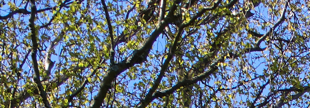
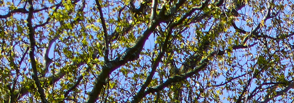
Truer Bluer Skies
LEFT: Trichromatic CFA | RIGHT: Traditional CFA.
The reason the sky is blue is because it disperses/reflects a lot of blue light. It also disperses a lot of UV light (much to the annoyance of my wife who burns faster than dry kindling), but your eyes don’t see that because your eyes’ receptors are not sensitive to UV light. Traditional CFAs leak UV and near UV light to the red channel, making the sky ever so slightly brighter and more magenta than it should be. The Trichromatic’s red channel is UV-proof and the sky is faithfully deeper and more blue as a result.
More Appetizing Fruits and Veggies
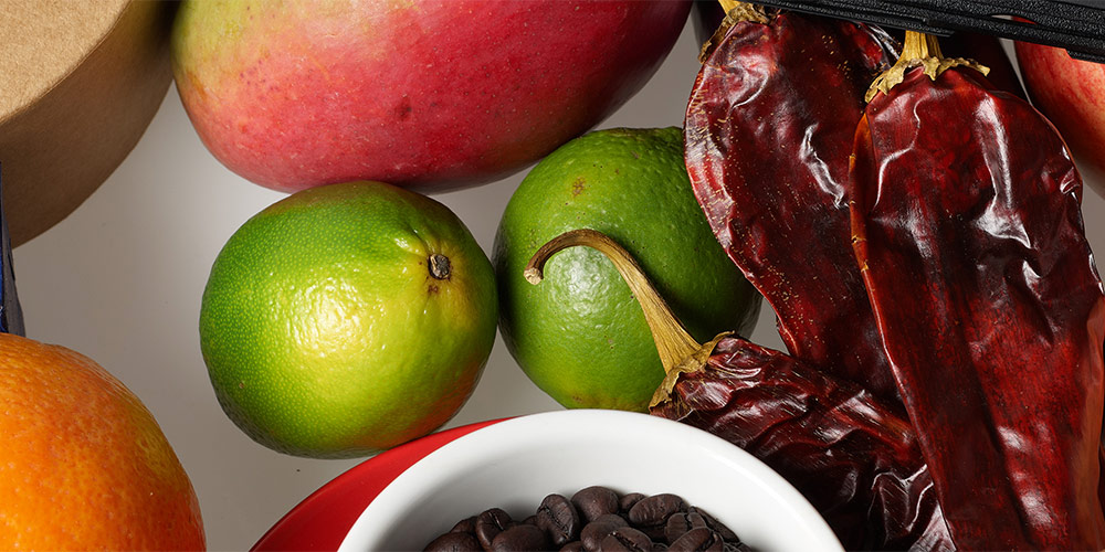
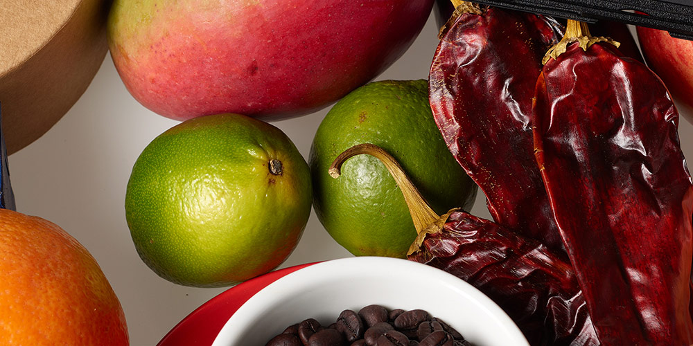
LEFT: Trichromatic CFA | RIGHT: Traditional CFA.
Above you’ll see the problematic subject of a fresh green lime, which is one of several fruits and vegetables that will show a significant difference. Pull a lime out of your fridge and look at it under natural daylight; in real life, a lime is very green, with very little red contamination. Then, as a handy example of a traditional CFA, pull out your iPhone and photograph it alongside a few other items that are also green, and you’re likely to see the green of the lime isn’t recorded quite as faithfully as the others.
Human beings are especially good at noticing the color of fruit and vegetables (this is part of the “not dying” drive of the human vision system mentioned in part 1). So while most subjects will only be subtly different, some traditionally problematic subjects will be significantly improved with the Trichromatic CFA.
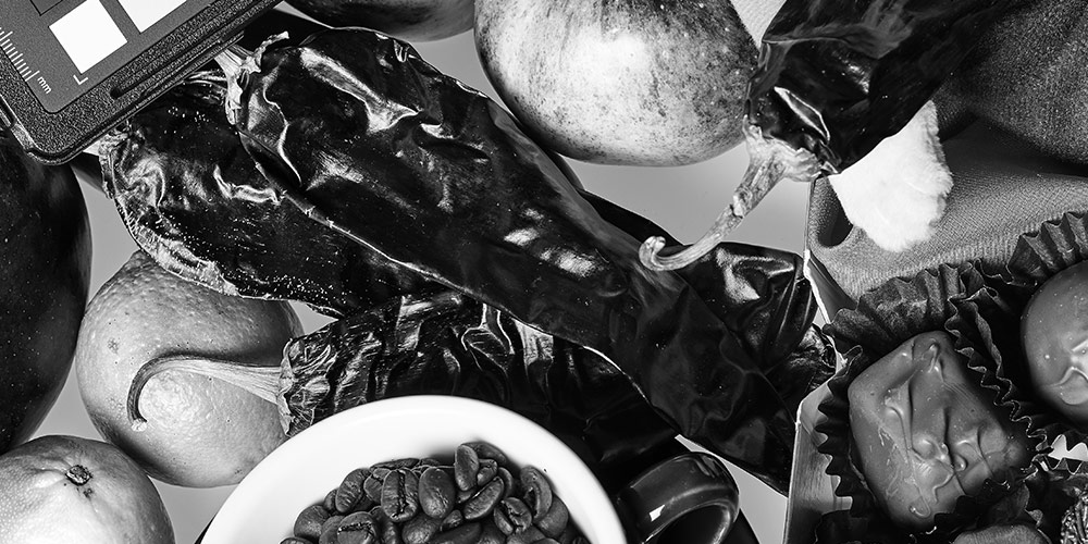
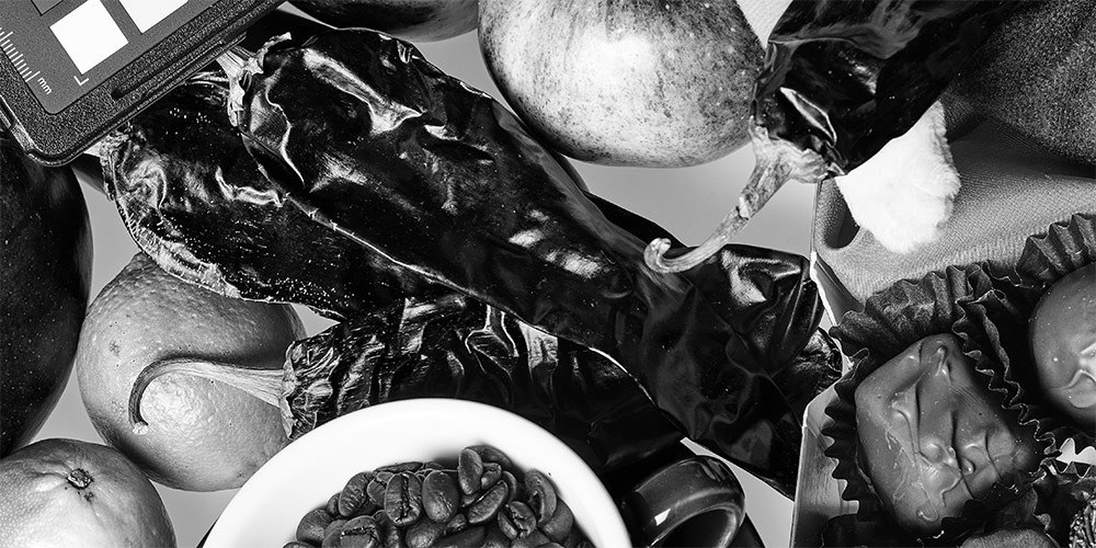
Dark Browns Free of Excess Red
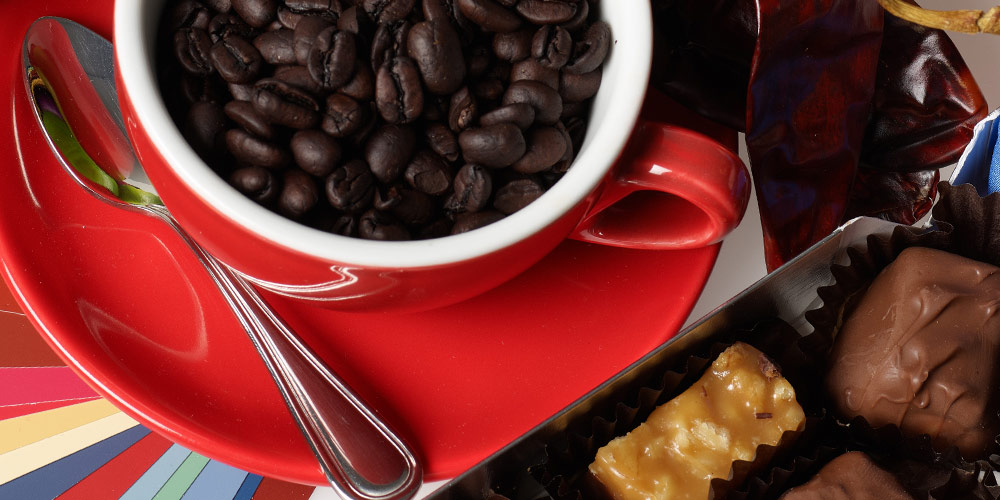
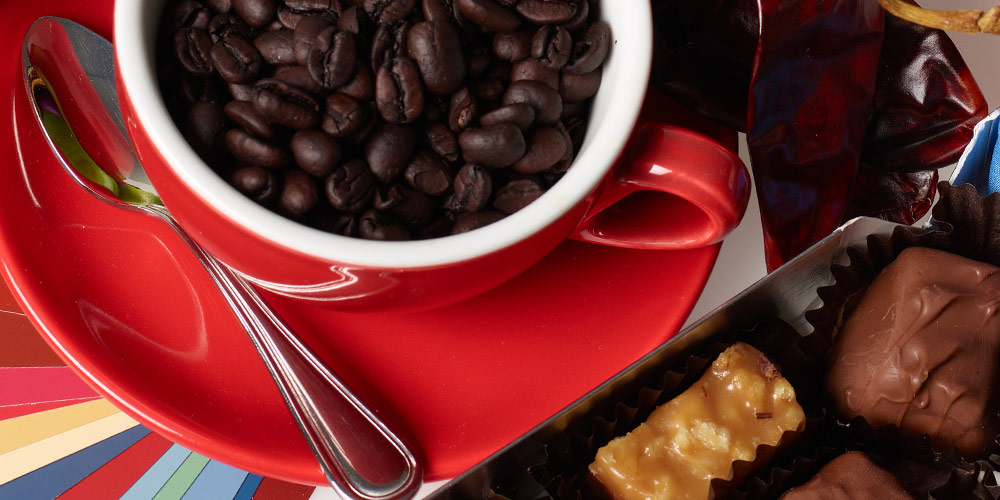
LEFT: Trichromatic CFA | RIGHT: Traditional CFA.
Traditional CFAs often struggle with a full and clean distinction between dark brown and dark red. This is partly because of deficiencies inherent in the CFA response, and partly because of the compromises that must be made when creating a profile to compensate for those deficiencies. With a traditional CFA, dark brown subjects are often rendered with more red than is accurate.
Dark brown leather, chocolate, coffee, and darker skin tones are specific examples. Note in the above example how the Traditional CFA and Trichromatic CFA render the red cup and paint swatches in a very similar manner, but the traditional CFA imbues a slight red in the coffee beans and chocolate.
If you or a client prefer an artificial warmth (i.e., more red and yellow) in the brown for a specific subject, it’s straightforward (in Capture One) to add such warmth back in; it’s much harder to remove it (without effecting other red subject matter).
Artificial Dyes (e.g. Apparel)

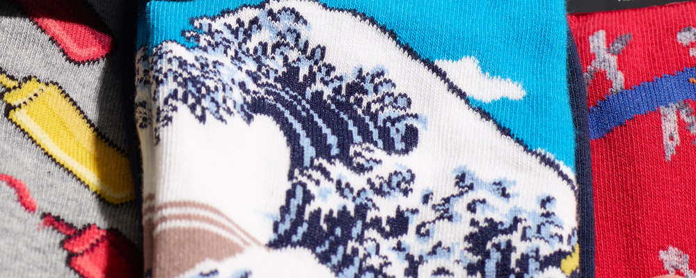
LEFT: Trichromatic CFA | RIGHT: Traditional CFA.
When apparel manufacturers design their dyes they do so with the human eye in mind. Dyes that reflect an especially high quantity of infrared or UV or have an especially spiky spectrum can often cause confusion for a traditional CFA. Early adopters of the Leica M8 will be aware of the impact this has when photographing dark black fabrics; a lack of IR filtration causes those blacks to become distinctly magenta. However, more subtle effects of UV, near-UV, and IR contamination can be found in the specific hue, saturation, and separation of different dyes.
In the above example note how the Trichromatic CFA captures the cleaner mustard-yellow of the left sock, and renders the right sock without magenta contamination; in both cases the Trichromatic is closer to the ground-truth of these socks.
Can’t I Just Fix That in Post?
It should also be said that most of the above can be tweaked/corrected in post. A slightly purple sky can be rotated in hue right back to a perfect blue in Capture One. The Color Editor in Capture One even features a Uniformity slider for Hue that is especially effectively at subtly massaging such colors.
But it’s also fair to say that such fixes take additional time, and can be complicated when there is other subject matter in the frame of the same hue which is already correct, and that not all such issues can be addressed with such post processing tweaks. Not every photographer will place that much value on starting with as accurate a color as possible, because not every photographer’s needs or preferences are the same.
Other Subject-Independent Improvements
Now that we’ve covered a handful of specific kinds of subject matter where you’ll see improvements, we’ll discuss some other improvements the Trichromatic CFA provides. These are not related to any specific subject matter.
Less Color Noise, Especially in Deep Shadows
Bringing the response of red, green, and blue into better balance has the knock-on effect of reducing color noise. In addition, the ability to discriminate the color of each pixel more accurately leaves less guesswork as to the correct color of strongly saturated subjects that fall in shadows, resulting in more accurate and smoother color on subjects that are (in the real world) smooth in color. Here’s an example of deep shadows pushed 6 stops with all color and noise reduction removed [insert].
More Nuanced B+W Conversions
LEFT: Trichromatic CFA | RIGHT: Traditional CFA. Under the same heavy-handed B+W adjustment
Black and white conversions (except with monochromatic sensors such as the Phase One Achromatic) are formed from the underlying color of the sensor. When the per pixel color is smoother, so too is the B+W conversion. Because of the already great 16-bit depth of the Phase One IQ3 100MP, this difference only really manifests in the Trichromatic when making strong adjustments, such as pulling down the blues of a sky, or adding local contrast. Even then, the distinction is subtle, especially when viewed on the web. Still, it’s worth mentioning because my experience is that B+W photographers, especially those coming from 4×5 or 8×10 film, are real sticklers for smooth transitions.
The finer distinction between adjacent colors also means the B+W sliders have a greater impact on pure-color subjects. For example, darkening a blue sky might only require using a -30 on the blue slider rather than -40.
If you’re interested in the differences in B+W conversion, I strongly encourage you to avail yourself of the downloadable raws mentioned at the bottom of this article. 8-bit web images are a very constrained medium in which to show subtle differences in B+W tonality and gradation.
Less Chromatic Aberration
LEFT: Trichromatic CFA | RIGHT: Traditional CFA. Lens Corrections OFF for both images.
When light passes through a medium like glass, it wants, very badly, to separate out to its constituent spectrum. That’s what happened to Newton when he placed a prism in a beam of sunlight and saw a rainbow. Modern lens design uses multiple tricks to tame the light back into alignment. But on some lenses you’ll find that on high contrast edges there is a purple or green fringe (or both). When you see this with cheap lenses, it’s usually because the lens is poorly corrected within the visible spectrum. That is, if you could shrink yourself down and stand on that pixel, your (human) eye would be bathed in purple or green light. But with well-designed lenses like the Schneider 150LS f/3.5 Blue Ring, the issue is being largely driven by UV light! By eliminating the UV contamination of a traditional CFA, the Trichromatic greatly decreases this chromatic aberration.
Better Handling of Tech Camera Movements

LEFT: Trichromatic CFA | RIGHT: Traditional CFA. Uncorrected LCC captures from Rodenstock 32HR with 15mm rise. Saturation enhanced for easier viewing.
The combination of improved color accuracy, decreased color noise, and decreased UV leakage means the Trichromatic CFA generates less color cast than a traditional CFA. For reasons having to do with the physical design of the CFA, there is slightly more luminance fall off with the Trichromatic. In most situations, the net effect is quite positive – the IQ3 100MP Trichromatic is even better suited to tech camera use than the Phase One IQ3 100MP.
A Note About Numbers and Color Checkers
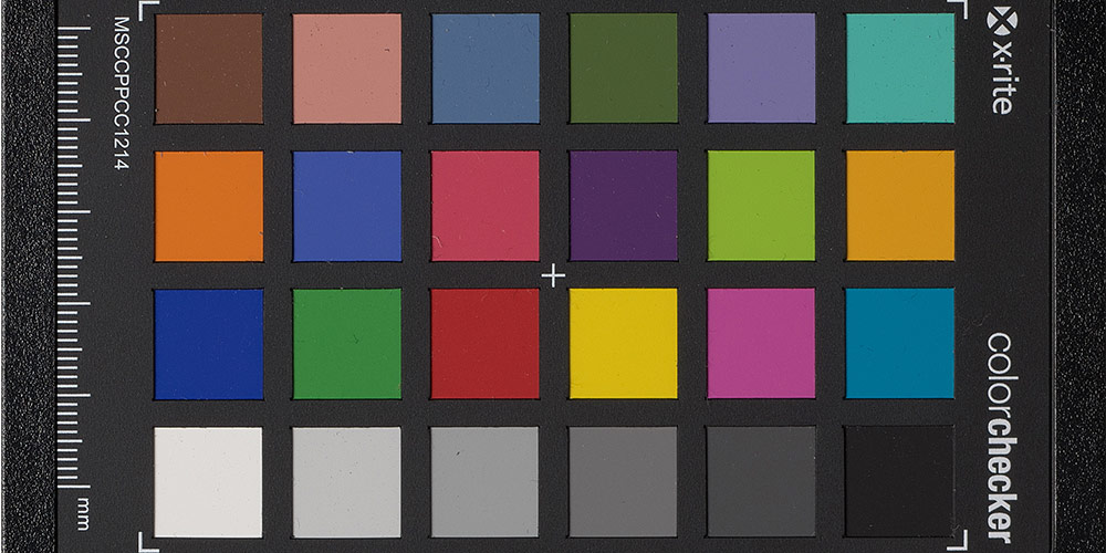
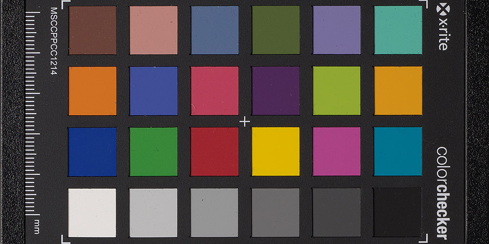
LEFT: Trichromatic CFA | RIGHT: Traditional CFA.
Note that I haven’t lingered on numerical accuracy as measured on a test target. That’s because, after you’ve achieved “very good” color improvements that matter in real world photography, this may not manifest in meaningfully different color target patch values. Color patch targets tend not to have tricky spectral characteristics, and in the case of the most popular targets, benefit from the tendency of profilers to pay special attention to and tune the performance of a camera at the specific colors of the target (“teaching to the test”).
In a numerically driven field like Cultural Heritage, we don’t anticipate the IQ3 Trichromatic providing a large numerical improvement. However, there is the potential that it will improve performance of spectrally-challenging subject matter like Cobalt Blue. We’ll be investigating this further in the coming months.
Also, a common requirement in these fields is to demonstrate compliance with a certain grade of FADGI (a set of criteria that measure image quality). But our backs designed with traditional CFAs already fly past the strongest color accuracy requirements of FADGI 4-star or the Metamorfoze or ISO equivalents. When you’re already achieving FADGI 4-star preservation-grade image quality, further improvements are always welcome, but may not be considered mission critical.
The Compromises
As detailed above, there is no free lunch. Phase One did not just wave a magic wand to summon better color. They made conscious decisions about their priorities and invested heavily in achieving them. The downsides of the Trichromatic CFA are:
- More Expensive: Both because the trichromatic CFA is more expensive to manufacture and because Phase One must recoup the cost of their R+D.
- New Color Response: This means that, among other things, LightRoom will have to be updated to include full raw support for this new back. Since the overwhelming majority of our clients use Capture One for raw processing that’s not an especially big problem, but it’s worth mentioning.
What About the ISO Range?
LEFT: Trichromatic CFA | RIGHT: Traditional CFA. ISO 12,800 with 20 points of shadow recovery and 10 points color noise reduction (lower than the default of 50). The slight difference in detail/sharpness is due a slight difference in focus points between these two images.
You may have noticed that the lower base ISO of the Trichromatic was not on the above list of compromises. That’s because listing it there would imply the IQ3 100MP Trichromatic is less capable in low light than its traditional-CFA brother. In fact, the opposite is true.
The Trichromatic has a base ISO of 35, a bit shy of 2/3rds of a stop slower than the IQ3 100MP’s base ISO of 50. So at the same ISO (e.g. ISO6400) the IQ3 100MP Trichromatic produces more luminance noise than does the IQ3 100MP. However, as discussed above its greater accuracy of color less to less per-pixel color guessing, which means the Trichromatic produces significantly less chroma noise at high ISO (i.e., color blotchiness). In my experience, photographers shooting at ISO 12,800 don’t expect or care that the resulting images will have a distinct luminance grain, but they do care a LOT about whether the resulting image has blotchiness, posterization, or other ugliness in the shadows.
Put differently, it’s slightly grainier, but considerably prettier, at higher ISO.
Dynamic Range is the combination of [how deep into shadows you can go] and [how much you can recover in the highlights]. The IQ3 100MP already had the highest usable dynamic range of any professional still camera. By cleaning up the shadow color noise the Trichromatic nudges that dynamic range just a smidgen higher, besting its brother and taking the crown of most usable dynamic range.
Better than the Best Ever
I was in my college’s marching band (#NerdPride) and, like many marching bands, we had an over-the-top slogan. Ours was “Better than the Best Ever.” I think it’s suitable to say the native color response of the IQ3 100MP Trichromatic is “Better Than the Best Ever.” But by no stretch of the imagination does that mean the previous “best ever” was less than totally awesome. The standard IQ3 100MP was and remains a stellar camera. That said, having dived deep into Trichromatic files I do get the slightest of twinges when I see the signs of subtle color contamination in files from another camera. Like floaters in your eyes, this contamination is subtle, but once noticed, impossible to ignore.
Will that twinge be enough to justify the cost? As we said at the top, that’s not our call to make – it’s yours. Our job is to help you understand the decision you’re making as fully as possible. The color on the Trichromatic is improved over any camera we’ve ever used; in most cases the difference is subtle; in some cases of problematic subject matter the difference is quite large. The color on the traditional-CFA IQ3 100MP was and continues to be very good.
The difference in the “as-new” price only tells part of the story since, at least during the initial period when we are changing out our demo inventory to Trichromatics, Digital Transitions will be selling our refurbished Phase One IQ3 100MP (non Trichromatic) backs with full manufacturer warranty, low shot counts, and excellent physical condition with all new accessories, at a significant savings compared to the Trichromatic model (which, of course, will be available available only in new condition for quite some time).
Popcorn Time
Now that you’ve had a detailed introduction to the art and science of the IQ3 100mp Trichromatic, you’ll enjoy hearing from Niels and Lau about their efforts:
As well as from one of the artists that Phase One used as a beta tester:
Need More?
If you have feedback, questions, or want to try either of these backs (or any other medium format system) please contact us. We’d love to hear from you.
Download Raw Files
You can download raw files used in this article here: Phase One IQ3 100mp Trichromatic Raw Files and Comparison Raws.